Financial Literacy App for College Student & Young Adult
Project Main Goal
This project is creating an app for college students/ young adults to learn more about money management.
The Team
-

Jess Martínez
UX Designer
Role : Content Strategist
-

Akshay Singh
UX Designer
Role : Information Architect
-

Haruka Inaba (Me)
UX Designer
Role : UX Researcher & UI Specialist
Tools
Miro
Zoom
Google Document
Figma
UX Design Process
User Interview Goals
To Learn about :
Current financial habits
Current financial management knowledge
Their Financial goals
How they choose who they bank with
Where they go for financial guidance
Affinity Maps Insights
We have gained a lot of insights on financial management from our user research.
Since the user interview results were such a large datas, Im going to divide into 3 main areas.
Financial Knowledge
Spending & Saving
Resources
1. Financial Knowledge
The highlights of the financial knowledge from the interviews with college students & young adults are:
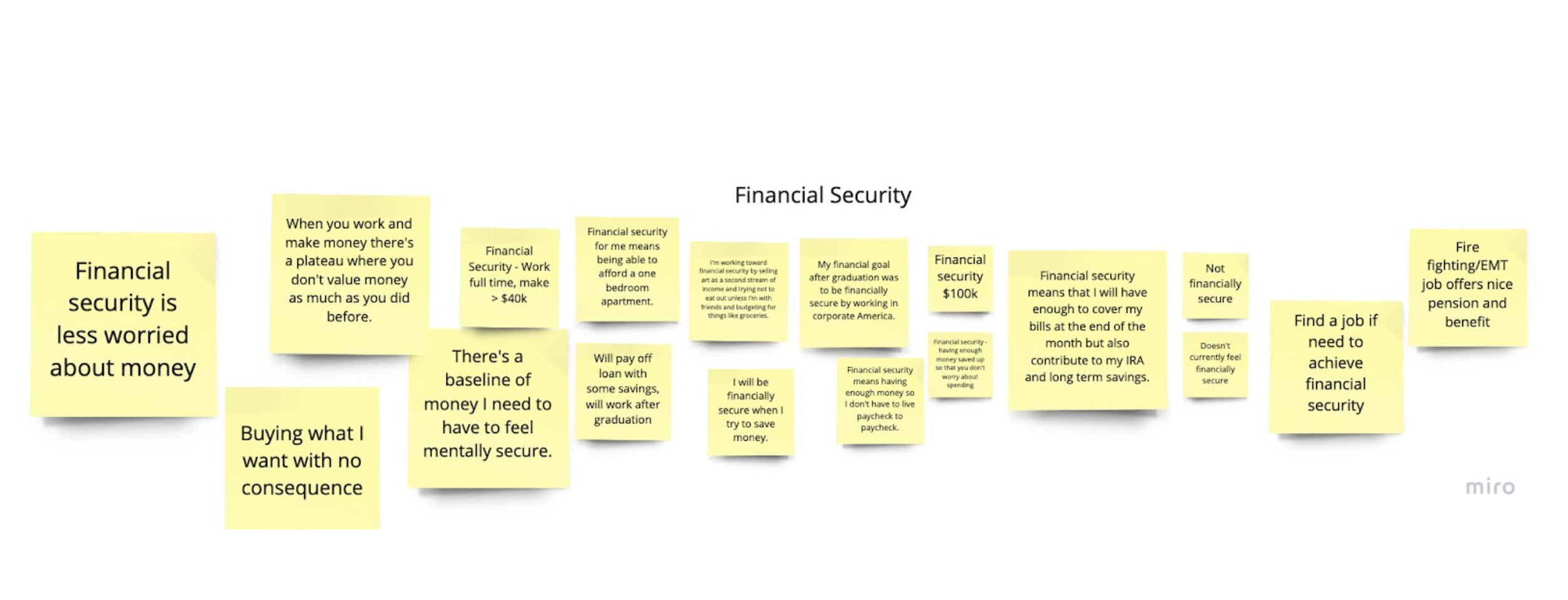
Thinking about their financial security in relation to their financial independence. They believe that learning more about money management will help them to be independent and feel more confident about mindful spending.
Some rely on their parent’s advices
Most do not use money management tools, if they do, they use something like Mint.
2. Spending & Saving
The highlights of the spending and saving :
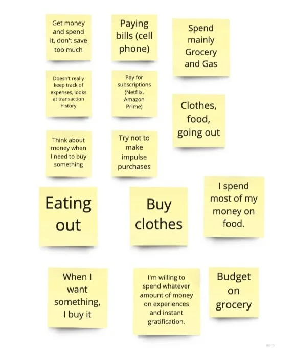
Splurge about once or twice a month
While some budge their expenses
Spending habits generally tend to be emotionally driven and focused on instant gratification
When thinking about saving, mostly users talked about saving up for housing and/or a car
All users equated a less than ideal financial position with a low quality of life
3. Resources
The highlights of the resources :
Mostly go to their parents for for financial guidance for a variety of reasons specially because there is a strong level of trust there and for some. their parents manage their money for them
Parents also influence the kind of money management tools they use as you can see the post it “ Dad uses same bank”
While most go to their parents for advice, the financial literacy varies widely across different families
User’s Main Concerns and Wants
Because their money management knowledge and resources are limited, they lack of a holistic view of financial literacy.
They wants to learn and have a strong independent finance life in order to relieve stress about their financial health.
Persona
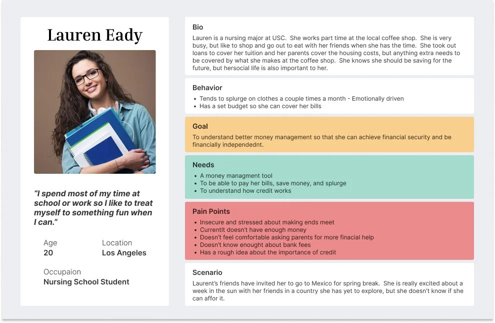
Based on what we have learned and analyzed the datas from the interviews. We were able to learn collage students and young adults behaviors, goals, needs and pain points to create a possible persona.
Problem Statement
“College students need a tool that helps them understand saving, spending, investing, loan terms and credit because they need the opportunity to learn more about personal finance to secure their financial independence.”
User Flow
This User Flow is specifically for college students / young adults to add expenses to the budget simulation tool on the app to have a realistic budgeting experience.
How Might We…. Statement
Help college students / young adults feel secure about their current and future financial situation.
Teach college students / young adults mindful spending and saving habits.
Design Process
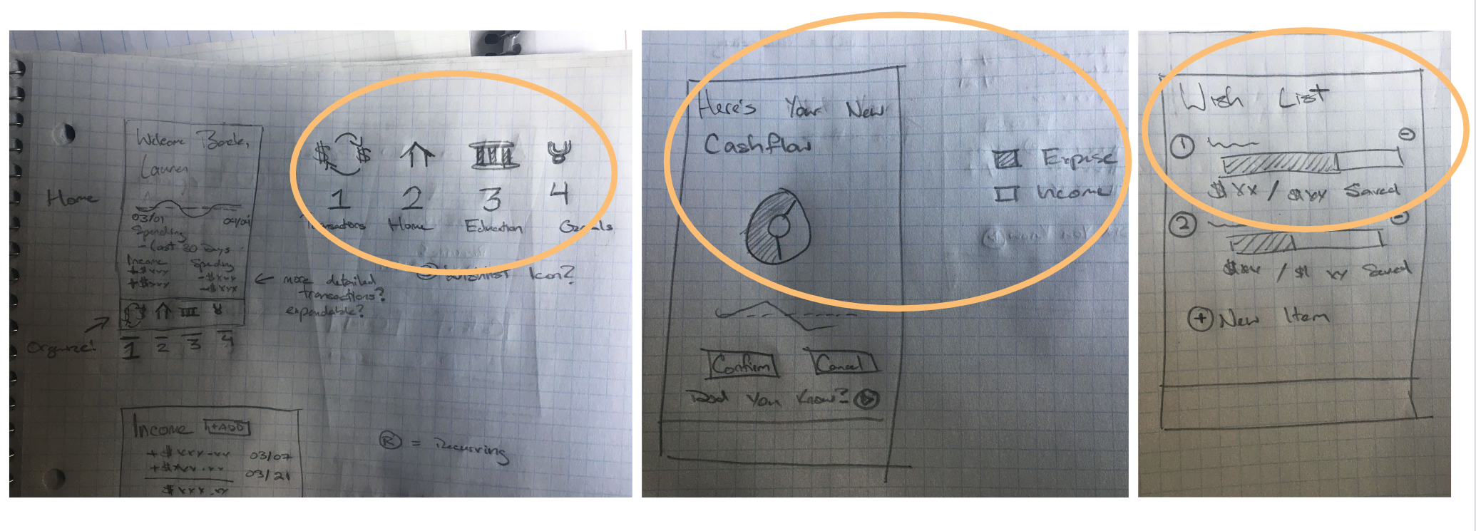
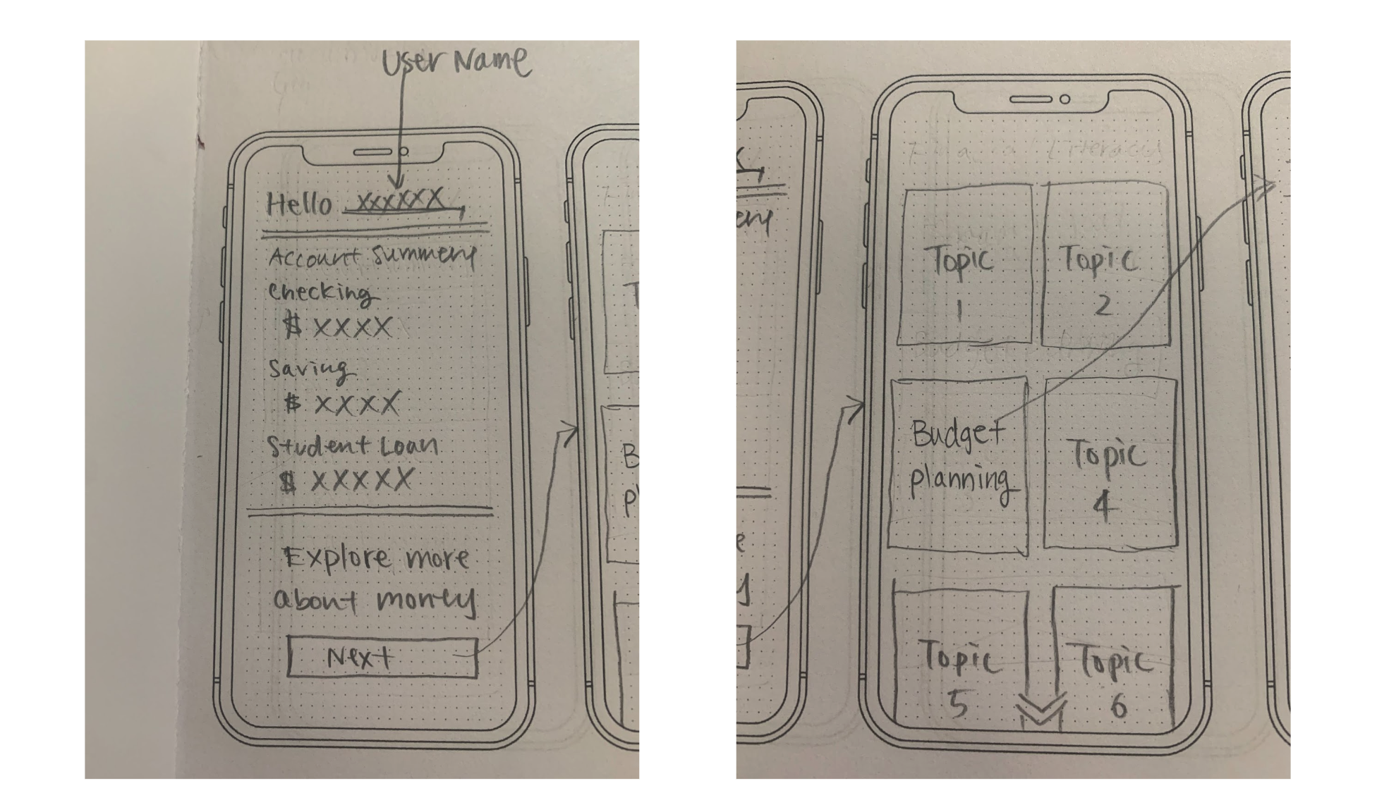
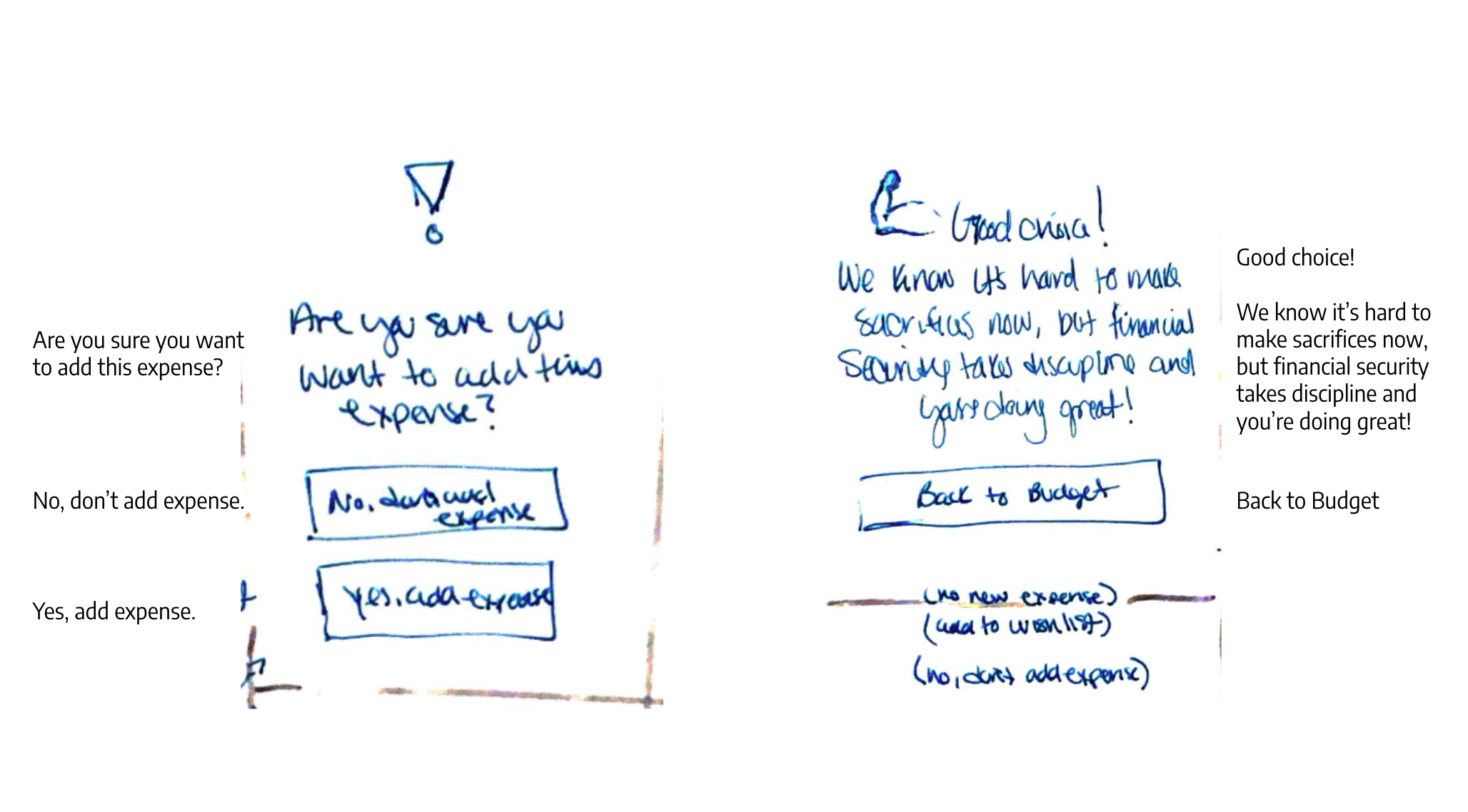
As a team, we brainstormed some of the ideas for screens and sketched out to share during the design process.
Here are some of the sketching we did for this app.
Please, scrolling to see our sketches below
1st Prototype
This is the original prototype we created within the 2 week project period.
Usability Test
Usability Test Goal
To understand the effectiveness of positive and negative reinforcements
Usability Test Guide
Add an expense - “Choose your own adventure.”
Bookmark an Article
Usability Test Feedback
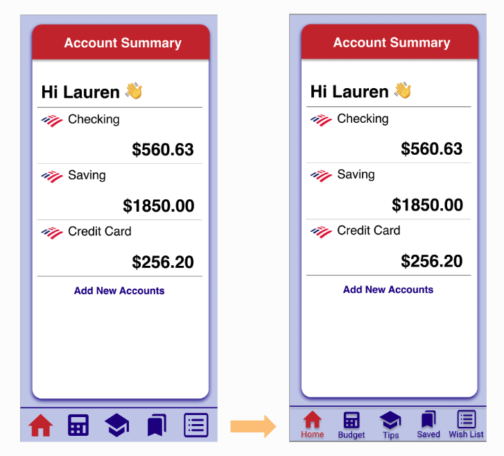
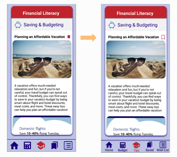
Global Navigation Tabs
Icon interpretation could be different in person to person.
To understand better, we have added icon labels under each icon.
Bookmark Icon
We made the bookmark bigger to make it more clear.
Also the user will see a filled bookmark when they added it to their bookmarks.
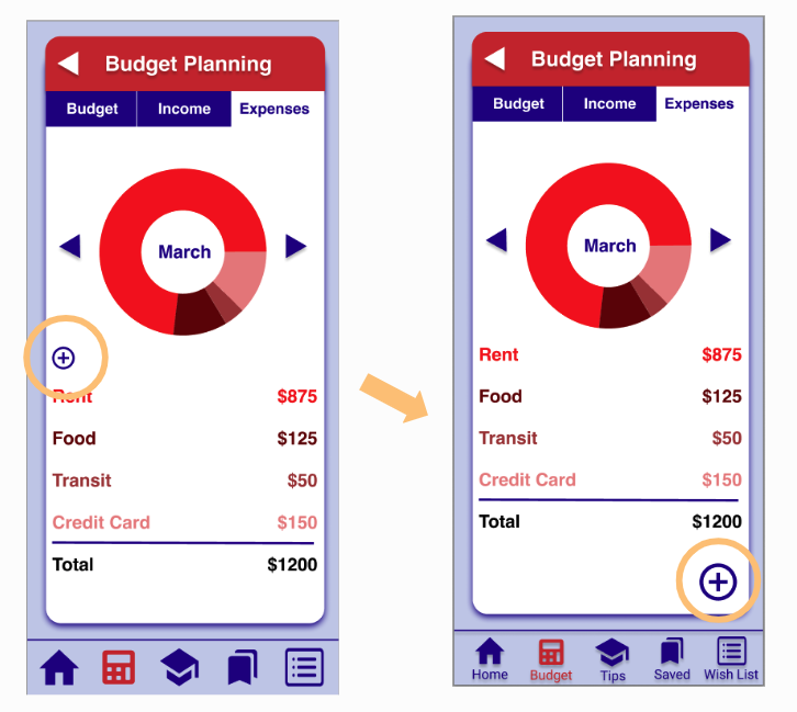
Add Expense Icon
We have changed the size of the add button and location of the button.
All the users did not know the button is for pie chart graph or the list.
And all the users said the button is too small to click.
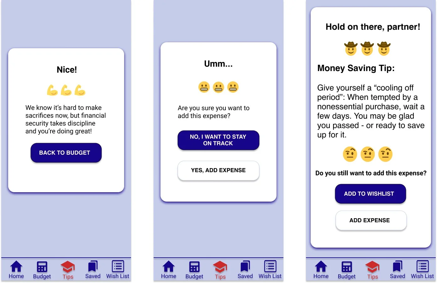
Warning Pages
“It really doesn’t want me to add the expense. It gave me like three warnings.”
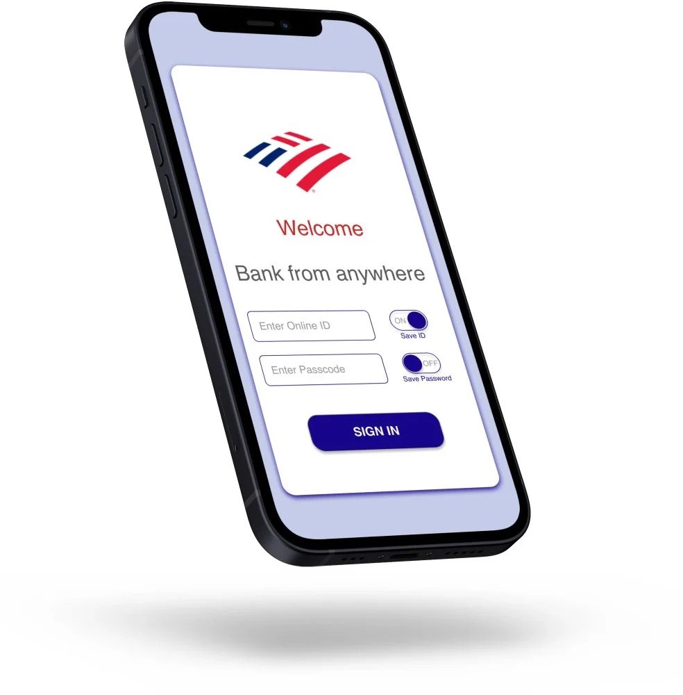
Final Prototype
After the project period ended, I spent some time to redesign the prototype. Adding some illustrations, fixing UI components, adding more screens to make user journey smoothly.
